Dark mode. Say the words aloud. (Go on. No one will hear.)
Sounds cool, doesn’t it? The term conjures visions of a professional wrestler turning heel, or the many protagonists—overcome by some deep-seated trauma, or experiencing a crisis of faith—you’ve seen embrace their darker side. Think Walter White, or maybe that time Superman sported five o’clock shadow and drowned his sorrows with a bottle of Johnnie Walker Red.

Sadly, the actual meaning of dark mode—in the context of web development, at least—is far less entertaining. But then, nothing is more entertaining than Drunk Superman.
What Is Dark Mode?
Dark mode is a low-light user interface that relies upon a dark color in the background—usually black or one of those shades of gray made famous in recent years. In this way, dark mode flips the default (white) background web designers have used for the last few decades.
If I may talk nerdy for a moment—yes, even nerdier than making a Superman 3 reference out of the gate—the scientific term lurking in the shadowy corner of this dark mode discussion is contrast polarity, which refers to the amount of contrast between the text and the background.
- Positive contrast polarity, or light mode, features a dark text on a light background.
- Negative contrast polarity, or dark mode, showcases light (or white) text on a dark (or black) background.
You might also encounter the term inverted polarity. While this diction laden with value judgment suggests that one mode is better than the other, they’re really just different.
Passing Fad, or Something More?
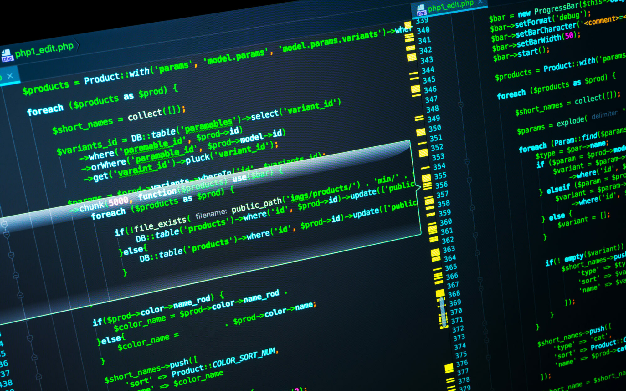
Computer users from several decades ago might scoff at the notion that this “mode” now has a special name. Dark mode is just what our screens looked like back then, after all. But in an effort to popularize personal computing, Microsoft and other companies worked to make the screen experience offered by their operating systems more closely mimic the printed page, so out went the black background and green text, even as movies like The Matrix forever propped up the stereotype that this is what hackers’ screens must look like:

In truth, most developers do like the black background, as it helps them better see their coding in progress. Designers like dark mode, too, as it’s nice to rejuvenate a design without completely reinventing it. It’s an opportunity to try on a new identity. You can even think of dark mode as an alter ego for websites and emails.
to more easily distinguish differently-colored code elements.
Such flexibility isn’t the only reason for its return to prominence, of course. A few popular websites began offering dark mode as an option to users in 2017, and Apple and Microsoft followed in 2018, which is when many of us first toggled our phone’s settings to explore the dark side. Lo and behold, many of us realized we liked the way it looked. A certain segment of consumers now want the option to choose.
Dark Mode and Rare Bird
Because about 65% of all emails are first opened on a mobile device, the emails we produce for clients are the main way Rare Bird currently works with dark mode. Tom Gasta and Troy Chandler, two members of the Flock who help shape our clients’ customer-facing emails, recently attended a Smashing Conference event online to refresh and add to their knowledge about how best to optimize emails for dark mode. While dark mode is not necessarily required to have a successful email strategy, it’s still something businesses—especially e-commerce entities displaying products within their emails—need to keep in mind.
Designers and developers do not have unlimited control of all elements of dark mode, however. At Rare Bird, we’re still learning what we can and can’t do within dark mode—and we’re not alone. As this Litmus post on the topic reminds us, “Email clients are still figuring out how to best implement Dark Mode and may be open to feedback from users—especially since not allowing email developers to target Dark Mode with their own styles can have a negative impact on legibility and accessibility.”
In other words, dark mode usage is almost never perfect, and each new offering in dark mode allows designers and developers the chance to tweak and improve their next attempts. “We’re aware of these challenges,” say Tom, “and we make adjustments where we can.”
Because different phone models and operating systems can trigger slight variations in how an email is displayed, Tom conducts an Email on Acid test to confirm that each email looks as we intend. This includes a glimpse of what an email looks like in dark mode on each system. That’s when Tom employs other tricks of the trade—making an image’s background transparent, for one, or creating white drop shadows—to offset any problems that might arise in dark mode.

models and operating systems—and also in dark mode.
Why Does Dark Mode Matter?
While some of the benefits of dark mode have been known for years, the public’s awareness of them is still fairly new. Dark mode can be better for your eyes, most of the time, and with daily screen time increasing year by year—something we also can track now, thanks to features added to our phones—we know our eyes need more rest, as well.
No phone or computer manufacturer truly wants us to tuck our devices away for an extended length of time, so dark mode is offered as a compelling and helpful alternative. Proponents argue that dark mode saves power and extends battery life, and that it cuts down on the amount of blue light emanating from your screen, but most devices offer other ways to reduce sleep-damaging blue light, too.
At least one source reports that “the bounce rate for sites with a dark theme is 60% lower than for sites with only a light mode.” There’s also some evidence that dark mode can improve website performance, especially for large e-commerce businesses, so dark mode could possibly play a larger role in our future web development.
Dark Mode and Accessibility
According to the CDC, more than one in four American adults live with a disability. That’s more than 61 million potential customers in America alone whose method of engagement with any given website should not be discounted or ignored. How might dark mode affect them?
Unfortunately, dark mode is a bit of a wash when it comes to accessibility; some issues are solved, but it often creates new ones, as well. We’ve written about accessibility issues before, and this topic is important to us. If carefully handled, monitored, and adjusted as needed, designs that make use of dark mode can play a role in effective and engaging websites without dismissing any part of the audience, but designers and developers need to think deeply about each user’s experience.
Thankfully, the user’s experience is something our designers and developers are always thinking about. How soon is too soon for a newsletter sign-up to appear? Have we driven the visitor to the desired call to action? And so much more.
If you have questions about dark mode, accessibility issues, or anything else we do, reach out today—we’d love to have that conversation.