Before the launch of our new website, I asked a seemingly simple question about a design element on our contact form: Since we require an entry for all four fields—first name, last name, email address, and message—can we just say “All fields are required” at the top and skip the asterisks entirely?
You know what I’m talking about, right? This thing:
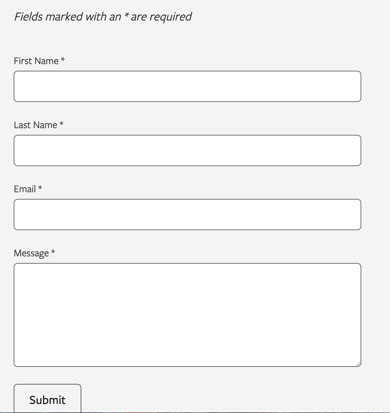
On an otherwise beautiful and modern website, the appearance of such asterisks seems both garish and redundant—and also anachronistic. But instead of making the quick edits on my own before launch, I posed the question in a Slack channel with designers and developers.
I’m glad I did.
Front-end developer Josiah Schaefer chimed in to say he’s encountered this suggestion before and actually wanted to try the cleaner approach of marking optional fields instead. But when he dug into the research, he learned it was an accessibility issue. It’s also a UX issue, as some users may not see the explanatory line at the top.
Even if users skip over the explanation atop the form, an asterisk lets them know there’s something that requires their attention—and by this point in the ever-growing history of the internet, most users already know what an asterisk on a form requires of them.
The Accessibility Case for Redundancy
While you can include a blanket instruction like “All fields are required” at the top of a form, research suggests users often ignore or forget such instructions. Asterisks make your website’s visitors encounter the requirement as they work through each field, not just when they first glance at the form header—if they glance at the form header at all.
The Web Accessibility Initiative suggests the best way to indicate a required field is to include the word “required” as part of the label, because asterisks are often not announced to screen reader users since they’re considered punctuation, and people with low vision can miss the asterisk due to its small size. This means the asterisk alone may not be enough. A website’s form may need multiple layers of indication.
Best practice recommendations include keeping the asterisk on each field label, adding explanatory text at the top, using the HTML required attribute for programmatic accessibility, and considering hidden text like “(required)” for screen readers.
Turns out that redundancy I was worried about is actually a feature, not a bug.
How the Asterisk Became the Standard
But what is the origin of this convention? According to UX expert Jared Spool, the practice predates the web entirely; he’s seen asterisks indicating required fields on mainframe data entry screens from the 1970s, though the original inventor remains unknown.
The asterisk likely migrated from the print industry, where it has long been used to mark footnotes directing readers to additional information.
The asterisk may have stuck around because it’s tidy, efficient, and visually distinctive from regular text, and its usage was reinforced over the decades through widespread industry adoption. Today, major design systems—think Google and Salesforce—still use the asterisk because users encounter it consistently across different platforms.
Per-field visual indicators reinforce the requirement exactly when users need it—while they are filling out each field—and help to ensure that users of all abilities can successfully complete your forms.
Sometimes a redundant solution is actually the right one.
You might also like:
Rare Bird delivers versatile marketing and digital solutions to diverse clientele across nearly every industry. Ready to leverage our expertise to address your business needs?
Let's talk.