The prevailing wisdom showcased on many design blogs, now that a clear majority of internet traffic goes through our mobile devices, is that websites should be designed primarily for small screens. That idea is built on solid logic. Many marketing companies focus on how data-driven they are, so it’s no surprise that a meaningful percentage of web designers now lean toward a mobile-first approach in their work. But an approach that prioritizes one device or the other isn’t putting its audience first.
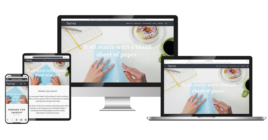
At Rare Bird, we believe true audience-first design requires crafting unique experiences that play to the strengths of each platform, so that the client’s story is delivered in a way that maximizes its effect on the audience.
“I understand the rationale behind the mobile-first approach, and I absolutely consider mobile throughout the desktop design process,” says Ashley Nixon, Rare Bird’s design director. “I invest an equal amount of time and effort into crafting the design for both mobile and desktop, and often it’s done at the same time. So to me, the debate about which should come first feels a bit false. The real goal is to create a cohesive, compelling experience across devices that tells the client’s story in the most meaningful way.”
Effective web design usually begins with a deep understanding of the target audience. Who are they? What devices do they prefer for different tasks and contexts? What are their expectations? Equipped with such insights, we can create experiences that guide users smoothly through the story the client needs to tell. The goal is to create the best possible environment for the message to resonate, inspire action, and forge lasting connections.
For some audiences and stories, mobile is indeed the main event. If the target users are constantly on the go, catching content in brief sessions (or even micro-moments), a mobile-first approach makes sense. But for many B2B and ecommerce sites, the desktop experience remains as important as ever. These audiences are more likely to engage deeply with content, comparison shop, and make significant purchases on a larger screen. Here, an immersive desktop-optimized design may be key to delivering the client’s story effectively. The largest ecommerce sites, when they’re interested in appealing directly to a mobile audience, will invest in developing an appropriate app for that purpose.
The reality is, most audiences today are multi-device users. Within arm’s reach as I write this are a MacBook, an iPad, and an iPhone, all of them used within the last thirty minutes or so as I gather research and stay in communication with the rest of the Flock. Like most users, I expect a frictionless experience as I move between devices. A mobile-only or desktop-only approach can leave many users feeling they’ve only heard part of the story. That’s why at Rare Bird, we advocate for designing mobile and desktop experiences in parallel—to ensure the story is told cohesively and compellingly, regardless of device.
An audience-first, multi-device storytelling practice also means taking advantage of the greater real estate and precision of desktop to deliver richer visuals and interactions that draw the user into the story—and this includes using the larger canvas when incorporating video, as well. For mobile, it means focusing on core messages and purposes, simplifying how the audience makes their way through the organized information and leveraging mobile-specific features as necessary. But always, the real focus should be continuity, so that transitioning between devices feels like the next chapter in the client’s story, not a separate tale.
Of course, an audience-first approach still relies upon mobile-friendly responsive layouts, intuitive navigation, and fast load times. But it also recognizes that different clients and audiences often require unique solutions to create the ideal environment for audience engagement. A story artfully designed for affluent retirees using tablets will feel different than one engineered for high-school students who binge-watch Netflix shows while endlessly scrolling vertical reels on their phones.
Putting people, not devices, at the center of the experience is informed by our goal to deeply understand the client’s target audience and thoughtfully shape the mobile and desktop experiences to their needs and expectations. When we do that, the resonance and impact of the client’s story more fully connects with customers and leads to the kind of engagement and results that make everyone happy.
You might also like:
Rare Bird delivers versatile marketing and digital solutions to diverse clientele across nearly every industry. Ready to leverage our expertise to address your business needs?
Let's talk.