Ashley:
As a designer, a question I’m often asked is, “How do you come up with a design?” I wish I could say it’s a simple process for me, some mythical magic that happens, and bam! I spit out a design. But sadly, it’s not.
When I came back to Rare Bird in 2013 (after a four-year hiatus) and Jim said, “One of the first projects we’d like you to work on is the Rare Bird site” I might have suddenly become a bit queasy. Of course I was honored to accept the challenge. But for a designer, nothing is more difficult than doing design work for yourself.
Our website has to be good. It has to be damn good. It has to capture our personality, showcase our work, demonstrate what we do, be responsive, do all the awesome code things we’ve always wanted to try… Where do I even start?
I decided to treat us as I would any client — take pencil to paper and begin sketching. You’re probably thinking that you have to be able to draw to be a designer; good thing that’s not true (although I deeply envy those who can). My drawing skills are equivalent to the quick sketches made during a game of Pictionary. You can generally tell what I’m getting at, but it won’t win any contests. After drawing several birds that looked more like sick hamsters, and writing every bird phrase I could think of — “Early bird gets the worm,” “Bird’s eye view,” etc. — I was stuck. Stuck worse than I have ever been. Caught in a quandary of whether I’m being too cliché by using birds, or if I’d be dumb to ignore our name. I pushed the project away for awhile to work on client projects and hoped inspiration and clarity would later come to me.
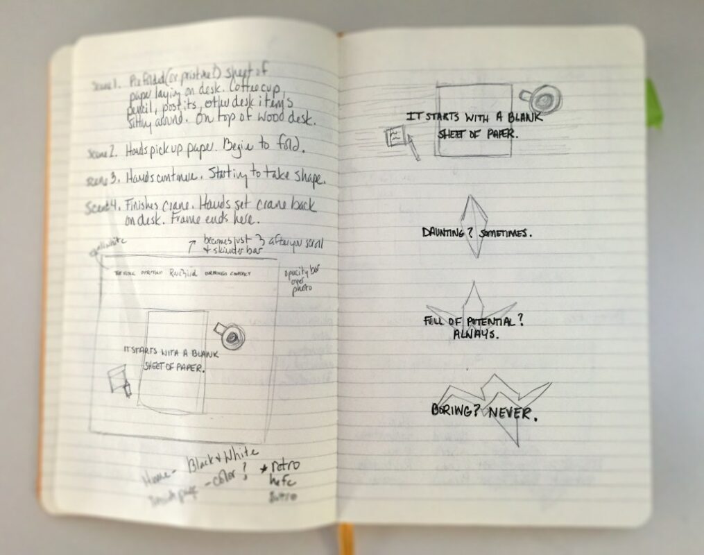
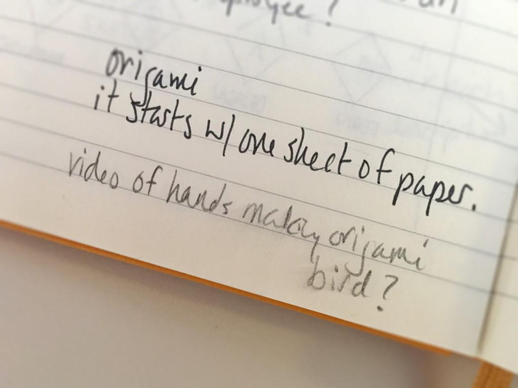
I’m not sure now what first sparked the flame-to-be, but I’m thankful something did. The origami idea hit me. The folding of paper to transform a flat sheet of paper into a finished work of art. Similar to a blank computer screen we in this industry all face in the hope of transforming design, words and code into a finished work of art. I discussed the idea with our copywriter, Lori, to make sure she didn’t think it was terrible. She replied, “…It all starts with a blank sheet of paper.” And that’s how we got fire.
Kyle:
I started at Rare Bird in the summer of 2010, our website was already four years old, and even though it was still doing its job just fine, every now and then we’d talk about giving it a significant update … but we never made it a priority. When 2014 came around, it had gone from a wish, to a stated priority, to the Site That Must Not Be Named. So when Ashley came back and was given the redesign assignment, we felt a true sense of hope that this work would move to a front burner. It was finally time to make something that better represented our design acumen and technical abilities in an industry that reinvents itself every four years (at least).
It All Starts with the Home Page
Ashley:
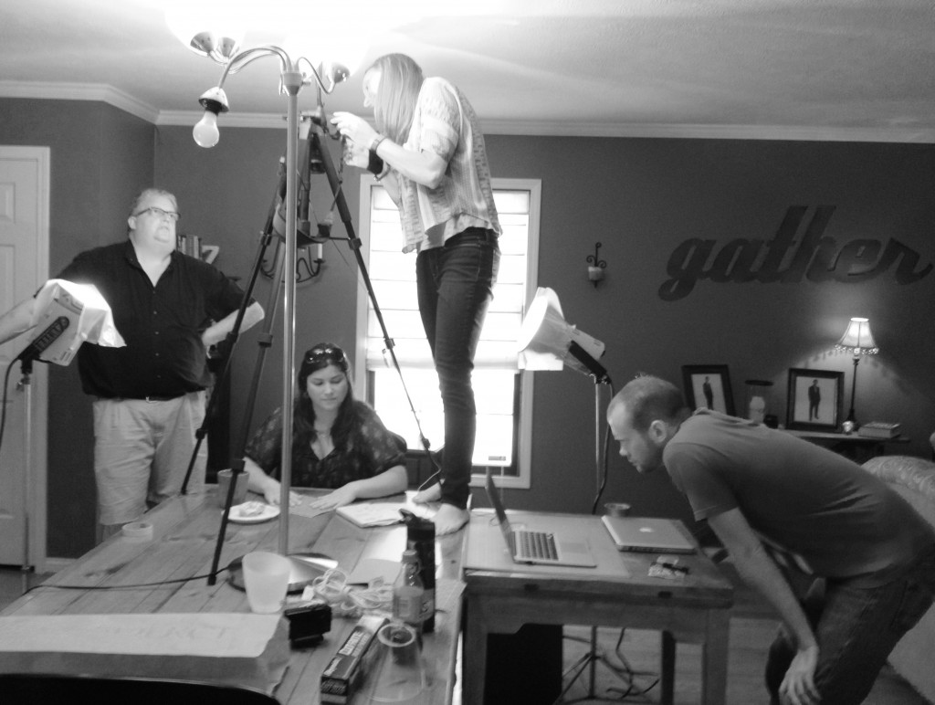
The home page was by far the hardest to finish. And maybe I shouldn’t even use the word “finish.” I don’t think it will ever truly be done. In the final hours before launch, we were still tweaking. In the hours after launch, we were still tweaking. Maybe when it’s your own site, that’s what you’re supposed to do. The home page is, of course, a visitor’s first impression. So how do we utilize this origami idea on the home page? After realizing a single photo could not capture this story, I imagined using stop motion to show the steps of making a bird out of paper. While we have the expertise — and obvious table-standing skills — to make a video, we decided that an investment in better lighting and videographers who make it their daily practice to shoot stop-motion videos would be a good idea. See more about this in Dear Diary: We Made a Website.
Kyle:
One normal day over the summer, Ashley and I were talking and she looked at me thoughtfully, seeming to evaluate if I could be trusted with what she was about to share. “So I’ve been making progress on the new Bird site…” I’m sure my eyes lit up. They might have started twitching.
She pulled up a document, and there it was. A draft, in progress, unfinished; more than that: playful, experimental, fresh.
We talked about the video. About what needed to go where. Inevitably I would remind her: have no second thoughts about whether we can or cannot build something. As the resident front-end developer, I hoped for a series of experiments and challenges. The video was just the beginning.
The Portfolio Challenge
Ashley:
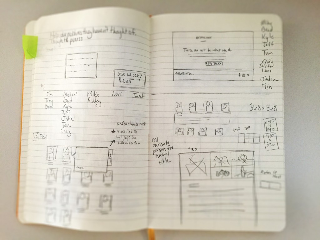
Creating our client portfolio was easy — from the perspective of how many sites we’ve made, how many strategies we’ve crafted — and yet hard… how do we pick what to show, after nearly 20 years in business? In the end, we decided on a case study approach — showing not just the sites we’ve made, but an introduction to the client. Each of our clients is unique: from a company that specializes in the distribution of all things yarn, to a sustainable practices farm or a fine jewelry store, they are all “rare” in their own way. So why not use this section to highlight that uniqueness? I relied on others to guide and inspire my work by asking for quotes and photography from each client. This collaborative process truly shaped the outcome of the pages and is what we enjoy most when building a website. Having the chance to work with our clients this way when building our own site? Priceless.
Kyle:
We’ve built a series of strong responsive web sites, but the new Bird site was our first truly mobile-first site, through and through. It can be easy when doing commercial design to rely on structures you’ve already built. But we wanted to start fresh, and that meant looking to and beyond the trends, embracing forward-thinking design and development.
For example, the portfolio landing/listing page allowed for us to play with a variety of transition and animation effects we’ve been meaning to perfect and employ. When hovering over a client’s photo, the following transition takes place:
This simple transition is actually pretty complicated. When the user hovers or focuses on one of these boxes, the following series of events have been carefully crafted, colored, and timed:

- The photo slightly scales up, giving a “zoom in” look
- The photo is blurred with a new CSS technique that works in modern browsers
- A red overlay fades in on top of the background image, further pulling visual attention away from the background
- The name of the client fades in
- The name of the client scales up (at a slightly different rate than the background’s scaling, lending a sense of depth)
Each of these actions combine to create a cohesive, playful effect.
The Flock. Good Times.
Ashley:
If the home page was hard, and the client portfolio was easy, our section was like vegan chocolate chip cookies — yummy fun (to us vegetarians/vegans).
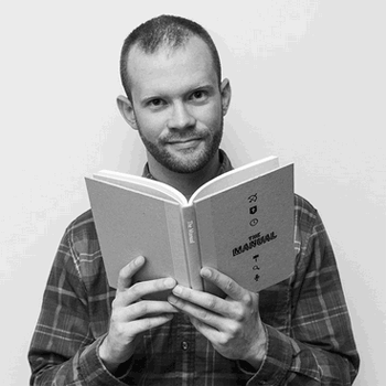
The Flock is the best part of our site, in my opinion. It truly shows us. I had a blast taking everyone’s headshot, which is often awkward and un-fun for most, and yet I enjoyed the challenge. I think the page made everyone happy, and that’s saying something. Turns out we look damn good in black and white! (Who knew?) Behind these photos you’ll find a peek into each of our lives. I asked everyone to send me photos that best represented them (our love affair with Instagram around here made that easy), and Lori asked us random questions to reveal a bit more about each of us. Flipping through these pages, you’ll discover gems like Justin’s obsession with Subaru, that we have lovers of both cats and dogs, Brad is famous on Google Maps, or that Ben should really be working for National Geographic. None of this has anything to do with how well we build websites… but yet, it does. It’s what makes us tick, what makes us such a great team.
Kyle:
The Flock pages were all fun on my end too — although I am hesitant to compare them to vegan chocolate chip cookies. 😉
My goal for the Flock landing page was to honor and progressively enhance Ashley’s beautiful photography with, much like on the portfolio landing page, subtle effects and transitions. One effect I’m putting up on Mom’s refrigerator: a CSS-generated vignette. Somewhere, my college photography and web design professor is smiling.
Staring contest: go.
For the Flock detail pages, I kept the photos, layout and copy styled simply to spec — between our team’s beautiful photos and thoughtful responses, the focus should be kept tight. However, when I saw Ashley’s playful origami birds made to replace left and right arrows, I knew they needed to be animated:
This was achieved using a combination of two different CSS animations that trigger on hover/focus. Little lively details like this are a delight for our team to design and build. Breathing life, surprise, and delight into our projects forges our personalities together with purpose, making something altogether other, and ultimately greater.
The End. (Or Not.)
As Ashley mentioned, a website is something of a living, breathing creature that is never really finished. So while we may continue to fiddle and tweak, enhance and adapt, the work is never really about us. Our site was, in some respects, a playground for us to stretch ourselves, try things out and take some risks. Everything we learned we will apply to the work we do for our clients. Who knew self-improvement could be so much fun?
You might also like:
Rare Bird delivers versatile marketing and digital solutions to diverse clientele across nearly every industry. Ready to leverage our expertise to address your business needs?
Let's talk.